Providing flexible footer widgets in WordPress
Footer widgets are a common feature in WordPress themes. They are typically broken up into columns of three or more, which each column containing its own widget area.
You can see live examples of footer widgets in the demos of our Cocina and Adaline themes.
They look nice in the demo, but put yourselves in the shoes of a user just starting out. Many of the “list” widgets, such as categories, monthly archives, and recent posts, wouldn’t look that great with barely any content.
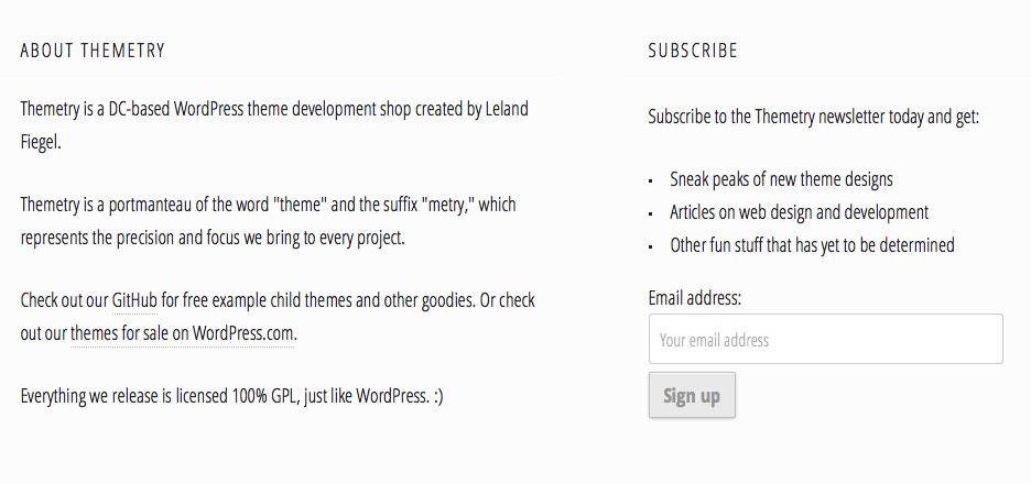
Maybe to start, you’d rather just have two columns of widgets. Let’s say a text widget containing an “About This Site” blurb on the left, and a newsletter opt-in form on the right.
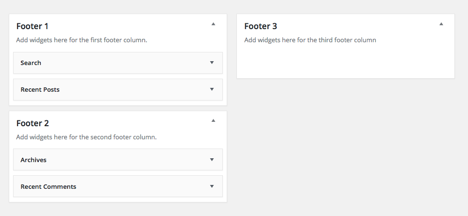
In a theme featuring the Flexible Footer Widgets technique, the user would simply have to not use one of the three footer widget areas, and the theme would automatically adjust the footer widget columns to be in halves rather than thirds.
No theme option needed.
Outline
We’ll accomplish the Flexible Footer Widgets technique in only three steps:
- Register three footer column widget areas in
functions.php. - Output the widget area divs wrapped in
is_active_sidebar()conditionals - Style the widget area divs depending on how many are active.
You can find a functional example theme in the Flexible Footer Widgets Theme repository.
Register the widget areas
The magic happens between lines 38 and 74 of our Flexible Footer Widgets Theme’s functions.php file.
Take note of the widget area IDs (footer-1, footer-2, footer-3) because we’re going to need them in subsequent steps.
Display the widget areas
Next, we’ll open up footer.php and plop in the following code:
Note how we wrap the entire footer-widgets div in a conditional checking if any of the footer widget areas are active. This prevents any footer-widget-related markup from being output on the page if no footer widget areas are active.
Important: Also note how the individual widget area columns are wrapped in is_active_sidebar() checks, including the associated footer-widget-area div. We want to make sure an “empty” div isn’t output in the code if the associated widget area is inactive.
Style the widget areas
Here’s where the magic starts.
At this point, if we had widgets in each of our three footer widget areas, they would stack on top of each other.
We want them to be displayed in columns, with widths that adjust depending on how many columns there are.
For example, 100% width if there’s one footer widget area, 50% width if there’s two footer widget areas, and 33.333% width if there’s three footer widget areas.
We can accomplish this sort of anticipatory width styling with pure CSS, thanks to a CSS3 technique outlined by Lea Verou: Styling elements based on sibling count.
We’ll be modifying it slightly to work with the markup we’ve laid out in our WordPress theme code already.
For example, if a div is the first child and the last child (i.e. .footer-widget-area:nth-child(1):nth-last-child(1)), you can assume it’s the only child of the parent.
If a div is the first child and the second to last child (i.e. .footer-widget-area:nth-child(1):nth-last-child(2)), you can assume there are two children of the parent.
And so on and so forth. It’s a brilliant technique that I don’t think I would’ve ever thought of myself.
At this point, our column widths will adjust based on how many widget areas are active. Check out the Flexible Footer Widgets Theme to give it a spin yourself.
Also note that we included the .footer-widgets class in our clearfix selectors.
And that’s all there is to it
Similar to our tutorial about automatic column layouts, this is another way to provide WordPress theme users more flexibility with less options.
I have to admit, my mind was a bit blown when I first discovered the CSS technique to detect number of siblings. I’ve also used it in the Cocina theme for post pagination.
When there’s only one post pagination link (like if it were the first or last post) it displays at full width, like this:
But when there’s two, it displays at half width, like this:
Can you think of any other practical applications for sibling detection CSS? Or any other ways to provide theme users more flexibility with less options? I’d love to hear about it in the comments.
Also, do the videos help?